52 · Survey Results: Survey Questions and Responses
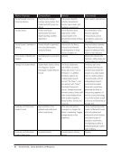
reorganize expert staff to better support the research enterprise. Helped clarify for staff how the newly designed facility
will support new approaches to learning and research. Access Services and Reference Service workflows are in the
process of being redesigned to improve the user experience.
Redesign of the website.
Relevant, effective changes to previous design and structure more user-friendly interface more logical arrangement of
information for audience.
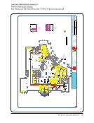
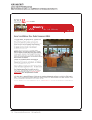
Renovation of main library facility, including student study areas and a cafe.
Results have been used to support renovations and improvements to physical facilities, the acquisition of Summon, and
the acquisition of an ERMS, as well as to establish usability testing of the website.
Several features of the renovation were based on these activities. Furniture design and noise abatement features are
two of the most prominent.
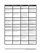
Still analyzing data from this survey.
Subject to available funding, research and analysis is in process to implement some of the results identified in the survey.
Survey results informed facilities changes and helped to address the need for a variety of study spaces for students,
including quiet study areas. It resulted in modifications to the library web page and our online access tools. We revised
and strengthened our student training program to enhance our students’ abilities to provide quality service.
The architect’s design of the Learning Commons and colors used were informed by the affinity focus groups, as well as
concerns raised in LibQUAL+® 2007. The furniture selection and placement was informed by student feedback.
The course has been revised based on feedback and is being marketed specifically to a group of students (Arizona
Assurance students) who have been indentified as specifically needing to acquire information literacy/fluency
competencies in order to help them succeed.
The design changes are still in process but will include installing more outlets, adding group study rooms, and additional
comfortable seating.
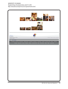
The home page for the Digital Collections website was redesigned to incorporate drop down menus for all browsing
categories. Also the Advanced Search feature is now available from the top-level page and there is an example of how
to use the wild card feature.
The library has acquired new printers with greater capacity additional databases and new titles for both reference and
general circulation.
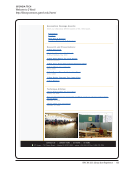
The library’s website was simplified.
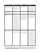
The performance support and web redesign studies resulted in many changes to the website. For example, the
homepage was tabbed to reduce visual clutter, a tab highlighting services provided by librarians was created (amongst
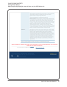
other things), and a “Haven’t found what you’re looking for” box was added to the bottom of each page to provide a
safety net for users who’ve dead-ended on the site.
The project began as a complete redesign of the online catalog’s user interface. UX activities are ongoing, however, and
we are committed to an iterative design process.
The renovation and creation of a 24-hour library space was directly influenced by the results of this study.


