3 Navigation
Navigation
–
Users
want
to
find
rather
than
search
and
search
rather
than
read
instructions.
Surface
high
demand
resources
–
We
need
to
aggressively
and
continually
identify
our
high
demand
resources
and
give
them
top
real
estate.
Titles
mentioned
often
are
Academic
Search
Premier
and
JSTOR
one
Web
page
in
demand
is
our
Hours
and
Directions.
What
are
the
others?
How
do
we
feature
them?
Match
user
expectation
in
Web
2.0
in
color
layout,
widgets,
and
services
–
This
is
not
currently
among
our
first
priorities.
Search
–
Many
users
desire
one
Google-
search
box.
We
need
to
improve
our
federated
search
function,
extending
it
to
more
databases
and
to
such
other
tools
as
our
website,
IRIS,
RUcore,
etc.
Personalization
and
context
–
point
of
need
Personalization
features
–
Users
want
to
manage
their
favorite
resources.
Delivery
of
services
to
tools
outside
the
L
context
–
Several
users
requested
the
availability
of
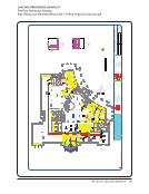
maps
that
would
guide
to
a
particular
book
in
our
stacks.
Such
maps
could
be
on
a
cell
phone
as
the
user
walks
to
the
stacks.
Other
places
to
deliver
our
services
include
departmental
websites,
Sakai,
myRutgers,
etc.
Create
different
Web
spaces
for
different
user
groups
-
Users
come
to
us
with
different
levels
of
expectation
and
skills
as
well
as
different
needs
dependent
on
discipline
and
status.
Help
when
needed
–
Users
requested
such
helps
as
one-
podcasts
at
point
of
need
and
very
brief
text
when
they
stumble.
Research
guides
-
Users
don't
want
to
bother
librarians.
We
need
to
explore
making
on
demand/online
librarians
more
available
and
investigate
how
to
incorporate
provision
of
subject
expertise
in
a
discipline.
Simplifying
Change
labels
–
While
we
constantly
strive
to
minimize
library
jargon,
our
users
want
us
to
do
better
and
give
them
an
easier
to
use
website.
Repave
–
We
need
to
get
rid
of
tripping
spots,
extra
clicks,
etc.
Top
page
Service
orientation
on
top
page
–
The
website
should
provide
services
supported
by
lower
pages
rather
than
lists
of
resources.
Front
page
delivery
–
The
left
hand
menu
is
too
cute,
crowded,
etc.
STRATEGIES Suggested
strategies
for
managing
the
web
redesign
and
development
are:
1.
Unify
redesign,
development,
and
ongoing
oversight
of
the
website
by
integrating
the
responsibilities
and
f
of
the
Web
Advisory
Committee
(WAC)
and
Web
Services
into
one
new
group.
Include
representation
from
the
IRIS
Public
Access
Committee
(IPAC).
Recognize
that
the
silos
of
website
content,
technology,
and
public
catalog
are
a
library
construct
and
are
not
meaningful
to
users,
who
rightly
integrate
the
services
in
their
mind.
164 · Representative Documents: User Feedback
Rutgers University
Studying Students to Enhance Library Services at Rutgers University
http://www.libraries.rutgers.edu/rul/staff/groups/ethnography/reports/ERP_Final_Report.pdf


