2
PRINCIPLES
These
principles
should
guide
current
and
future
redesign
and
development
of
the
Libraries
website:
1.
FlexibilityUsers
.
should
be
able
to
customize
both
their
experience
and
where
they
receive
information
as
individuals
and
as
members
of
groups.
2.
IntegrationThe
.
Libraries
website
needs
to
integrate
more
tightly
with
such
user
tools
as
Sakai,
the
university
website,
myRutgers,
departmental
websites,
continuous
education,
RUcore.
3.
Information
literacyThe
.
Libraries
website
should
express
and
be
an
integral
part
of
information
literacy
learning
at
the
university.
4.
Simplicity.
Less
is
definitely
more.
The
Libraries
website
should
be
easy
to
get
to
and
remember,
with
fewer
clicks
and
explicit
language.
5.
Context.
Website
users
shoulalways
d
know
where
they
are
and
how
they
got
there.
6.
Self-
People
want
to
find
and
do
for
themselves.
Tool
development
should
focus
on
self-
7.
Process.There
needs
to
be
an
iterative
and
permanent
process
of
redesign
and
development
t
incorporates
version
releases,
constant
rethinking
of
strategy,
and
constant
feedback.
PRIORITIES
After
reviewing
all
reports
and
comments,
the
Core
Team
has
identified
the
following
priorities
for
initial
website
redesign
and
developmentThey
.
are
listed
by
priority
within
broad
categories.The
categories
themselves
are
not
prioritized
but
are
listed
alphabetically.
Access
Single
sign-
–
Users
desire
one
login
for
all
services
we
offer.
It
should
be
integrated
with
the
login
for
remote
access.
They
report
not
being
able
to
access
resources
remotely
without
paying.
E-
process
E-
process
–
Our
process
for
finding
ejournals
and
articles
in
them
is
undeniably
broken.
Users
need
improved
discovery,
navigation,
URL
access,
selection
by
discipline,
and
enhanced
federated
searching
capabilities.
They
come
to
us
needing
a
particular
article
or
wanting
articles
on
a
particular
topic,
and
we
present
them
with
lists
of
database
and
journal
titles.
They
scroll
over
Searchlight
and
do
not
see
that
it
might
be
the
single
search
box
they
desire.
Users
search
our
databases
or
Google
Scholar
and
cannot
figure
out
how
to
link
to
our
e-
even
when
we
offer
them.
Users
experience
requests
for
payment
when
accessing
our
resources
remotely.
Hel p
users
identify
databases
to
use
for
their
research
–
The
broad
subject
breakdowns
of
indexes
and
databases,
advanced
search
subject
choices
within
Searchlight,
and
the
research
guides
are
not
doing
the
job.
They
need
to
be
brought
together
and
surfaced.
SPEC Kit 322: Library User Experience · 163
Rutgers University
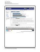
Studying Students to Enhance Library Services at Rutgers University
http://www.libraries.rutgers.edu/rul/staff/groups/ethnography/reports/ERP_Final_Report.pdf
PRINCIPLES
These
principles
should
guide
current
and
future
redesign
and
development
of
the
Libraries
website:
1.
FlexibilityUsers
.
should
be
able
to
customize
both
their
experience
and
where
they
receive
information
as
individuals
and
as
members
of
groups.
2.
IntegrationThe
.
Libraries
website
needs
to
integrate
more
tightly
with
such
user
tools
as
Sakai,
the
university
website,
myRutgers,
departmental
websites,
continuous
education,
RUcore.
3.
Information
literacyThe
.
Libraries
website
should
express
and
be
an
integral
part
of
information
literacy
learning
at
the
university.
4.
Simplicity.
Less
is
definitely
more.
The
Libraries
website
should
be
easy
to
get
to
and
remember,
with
fewer
clicks
and
explicit
language.
5.
Context.
Website
users
shoulalways
d
know
where
they
are
and
how
they
got
there.
6.
Self-
People
want
to
find
and
do
for
themselves.
Tool
development
should
focus
on
self-
7.
Process.There
needs
to
be
an
iterative
and
permanent
process
of
redesign
and
development
t
incorporates
version
releases,
constant
rethinking
of
strategy,
and
constant
feedback.
PRIORITIES
After
reviewing
all
reports
and
comments,
the
Core
Team
has
identified
the
following
priorities
for
initial
website
redesign
and
developmentThey
.
are
listed
by
priority
within
broad
categories.The
categories
themselves
are
not
prioritized
but
are
listed
alphabetically.
Access
Single
sign-
–
Users
desire
one
login
for
all
services
we
offer.
It
should
be
integrated
with
the
login
for
remote
access.
They
report
not
being
able
to
access
resources
remotely
without
paying.
E-
process
E-
process
–
Our
process
for
finding
ejournals
and
articles
in
them
is
undeniably
broken.
Users
need
improved
discovery,
navigation,
URL
access,
selection
by
discipline,
and
enhanced
federated
searching
capabilities.
They
come
to
us
needing
a
particular
article
or
wanting
articles
on
a
particular
topic,
and
we
present
them
with
lists
of
database
and
journal
titles.
They
scroll
over
Searchlight
and
do
not
see
that
it
might
be
the
single
search
box
they
desire.
Users
search
our
databases
or
Scholar
and
cannot
figure
out
how
to
link
to
our
e-
even
when
we
offer
them.
Users
experience
requests
for
payment
when
accessing
our
resources
remotely.
Hel p
users
identify
databases
to
use
for
their
research
–
The
broad
subject
breakdowns
of
indexes
and
databases,
advanced
search
subject
choices
within
Searchlight,
and
the
research
guides
are
not
doing
the
job.
They
need
to
be
brought
together
and
surfaced.
SPEC Kit 322: Library User Experience · 163
Rutgers University
Studying Students to Enhance Library Services at Rutgers University
http://www.libraries.rutgers.edu/rul/staff/groups/ethnography/reports/ERP_Final_Report.pdf


