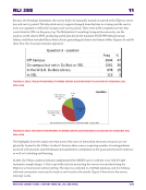
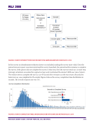
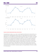
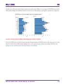
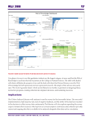
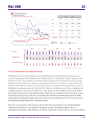
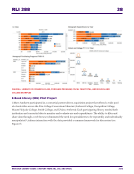
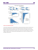
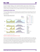
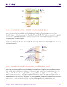
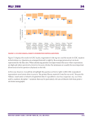
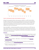
RLI 288 33 RESEARCH LIBRARY ISSUES: A REPORT FROM ARL, CNI, AND SPARC 2016 Because the graphs also show detail about charges and discharges—the blue and pink lines—the figure points to a possible explanation. Notice in the graph at the top how the blue curve representing discharges is shifted to the right, or later in the day. This suggests that David Lam library staff do more of their daily discharge work in the slower evening period, potentially helping daytime staff remain available to users who visit the desk for in-person help. We cannot know from this data whether other factors account for the difference but the graphs support a hypothesis that merits further exploration and may help branches establish and share best practices. Visualizing Results of the LibQUAL+® Survey The second example from UBC relies on a data set that is familiar to many North American academic libraries: the LibQUAL+ survey. This is a rich data set, particularly when longitudinal data is available. In practice, however, the potential for examining change over time was not realized at UBC because summary data was often presented in formats that made comparisons time consuming. One of UBC Library’s first experiments with Tableau was to reformat the raw data from three years’ worth of LibQUAL+ surveys. The resulting online report enables longitudinal comparison and makes it easier for library staff to view responses by user group and by LibQUAL+ question (Figure 12). A vertical orange band is used to represent the range between the average minimum and desired service levels, and a blue dot or line represents UBC Library’s perceived service level for a given question. FIGURE 12. VISUAL REPRESENTATION OF LIBQUAL+ RESULTS FOR A SAMPLE QUESTION UBC results for the 2013 LibQUAL+ survey identified “information control” as the dimension where the most improvement was needed to meet respondent expectations. But the “information control” dimension covers a wide range of activities and more detail is required to determine where in particular the library should focus its improvement efforts. Because the visualization is based on raw data rather than aggregated scores, Tableau makes it easy to drill further down and view scores for individual questions in this group simply by adding new dimensions to the display.

