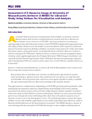
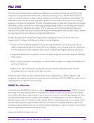
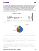
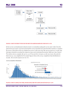
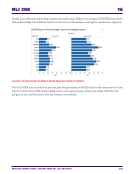
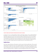
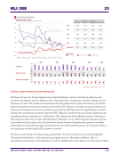
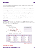
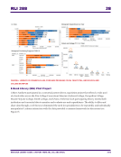
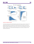
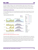
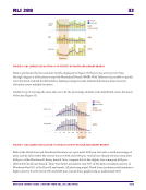
RLI 288 30 RESEARCH LIBRARY ISSUES: A REPORT FROM ARL, CNI, AND SPARC 2016 FIGURE 8. GRAPHIC VISUALIZATION CONTRASTED WITH SPREADSHEET TABLE DISPLAY The dashboards displayed in Figures 7 and 8 were central to reaching a shared understanding of the financial implications and consortial decisions related to the pilot project. Tableau at the University of British Columbia Library—by Jeremy Buhler Using Tableau to Explore the Data The above examples from The Ohio State University and UMass Amherst Libraries focus on Tableau as a publishing and data-sharing platform. This third section describes Tableau’s potential as a tool for data exploration. Part of the assessment librarian’s role at the University of British Columbia (UBC) is to make management and user-experience data more accessible to those who need it to inform decisions. But providing timely access to data is only part of the picture and means little unless the audience is also engaged with the data presented. Stephen Few, an expert in the field of visual perception and dashboard design, provides guidelines for data presentation in his book Information Dashboard Design: The Effective Visual Communication of Data. In general a dashboard will be more effective if it is focused on fulfilling a specific data need,4 and if done well it may also prompt new questions from the audience. These new questions are one measure of engagement, but to sustain engagement with the data and reward the audience for asking deeper and potentially more fruitful questions we need tools that can quickly shuffle and re-package the source material to respond to new lines of inquiry.
Help