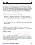
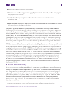
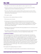
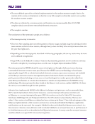
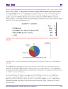
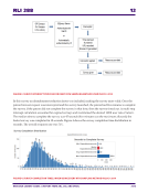
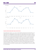
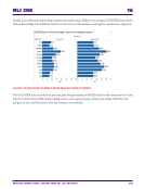
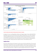
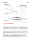
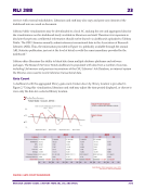
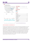
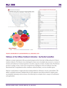
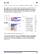
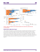
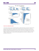
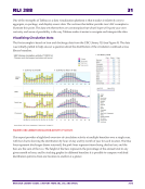
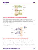
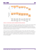
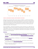
RLI 288 14 RESEARCH LIBRARY ISSUES: A REPORT FROM ARL, CNI, AND SPARC 2016 FIGURE 5B. MONTHLY MINES SURVEY AND ALL PROXY TRAFFIC Using dashboards to display survey results visually helped the staff absorb and understand the survey results. The side-by-side presentation makes it easier to see relationships between responses within a single holistic view. The MINES User Group Dashboard (see Figure 6) shows the summary of all results. This broad overview provides the baseline for deeper analysis. For example, it is useful to see that 89% of overall use occurs outside the library buildings and that 53% of use was in support of teaching or classwork. Visualizing MINES data with Tableau increases utility because the data is easily filtered to answer a range of detailed questions posed by individual staff. A liaison librarian to engineering can see that 92% of graduate student use happens outside the libraries and that 45% of use is for thesis or dissertation work (see Figure 7). This kind of close analysis of the questions informs instruction, outreach, and support to constituents. The power comes not only from aggregate data or from a single conclusion but also from the ability to understand specific and integrated aspects of the data as needed for various purposes.

