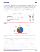
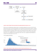
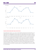
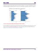
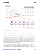
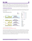
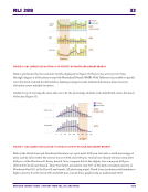
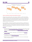
RLI 288 31 RESEARCH LIBRARY ISSUES: A REPORT FROM ARL, CNI, AND SPARC 2016 One of the strengths of Tableau as a data visualization platform is that it makes it relatively easy to aggregate, re-package, and display source data. The sections that follow provide two UBC examples to illustrate this point. The data sets themselves are commonplace but what I hope will spark your own curiosity and sense of possibility is the way Tableau makes it easier to navigate and interpret the data. Visualizing Circulation Data The first example is based on loan and discharge data from the UBC Library ILS (see Figure 9). The data was initially pulled to help answer a question about the distribution of the circulation workload across library branches. FIGURE 9. UBC LIBRARY CIRCULATION ACTIVITY, FY 2013/14 This report provides a high-level overview of circulation activity at multiple branches over a single year, with bar charts showing the distribution by hour of day and by month of year for each location. The blue lines represent discharges (items returned), the pink lines represent items being checked out, and the bars are the sum of the two. The height of the bars represents the percentage of the annual total in any given month or hour, and by stacking graphs for different branches it is possible to compare workload distribution patterns from one location to another at a glance.

