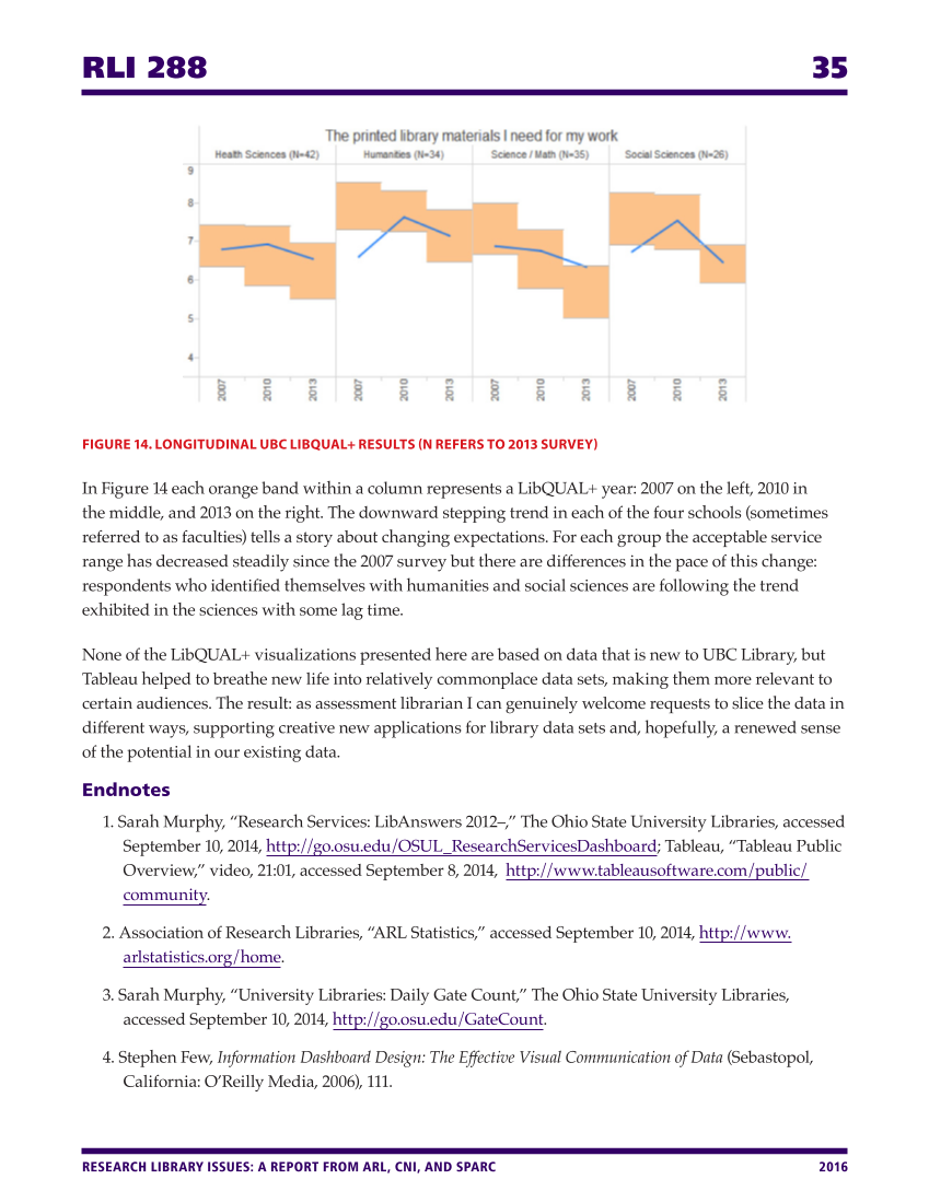
RLI 288 35 RESEARCH LIBRARY ISSUES: A REPORT FROM ARL, CNI, AND SPARC 2016 FIGURE 14. LONGITUDINAL UBC LIBQUAL+ RESULTS (N REFERS TO 2013 SURVEY) In Figure 14 each orange band within a column represents a LibQUAL+ year: 2007 on the left, 2010 in the middle, and 2013 on the right. The downward stepping trend in each of the four schools (sometimes referred to as faculties) tells a story about changing expectations. For each group the acceptable service range has decreased steadily since the 2007 survey but there are differences in the pace of this change: respondents who identified themselves with humanities and social sciences are following the trend exhibited in the sciences with some lag time. None of the LibQUAL+ visualizations presented here are based on data that is new to UBC Library, but Tableau helped to breathe new life into relatively commonplace data sets, making them more relevant to certain audiences. The result: as assessment librarian I can genuinely welcome requests to slice the data in different ways, supporting creative new applications for library data sets and, hopefully, a renewed sense of the potential in our existing data. Endnotes 1. Sarah Murphy, “Research Services: LibAnswers 2012–,” The Ohio State University Libraries, accessed September 10, 2014, http://go.osu.edu/OSUL_ResearchServicesDashboard Tableau, “Tableau Public Overview,” video, 21:01, accessed September 8, 2014, http://www.tableausoftware.com/public/ community. 2. Association of Research Libraries, “ARL Statistics,” accessed September 10, 2014, http://www. arlstatistics.org/home. 3. Sarah Murphy, “University Libraries: Daily Gate Count,” The Ohio State University Libraries, accessed September 10, 2014, http://go.osu.edu/GateCount. 4. Stephen Few, Information Dashboard Design: The Effective Visual Communication of Data (Sebastopol, California: O’Reilly Media, 2006), 111.
Help


